
The Account Tabs block creates a tabbed interface on any page. It is the standard way to build a member account page in Fundations, grouping sections such as profile, fundraising history, and donations into separate panels without requiring a page reload.

Why use this
A crowdfunding account page typically contains several unrelated sections. Presenting them all on a single scrollable page is hard to navigate, especially on mobile. Tabs let visitors jump directly to what they need. URL-based deep-linking means you can send a supporter straight to a specific panel from an email or notification link.
What it does
The block renders a tab bar and a set of content panels. Clicking a tab reveals its panel and hides the others. Tabs can be arranged horizontally (the default) or vertically. Two visual styles are available: pills and underline.
When a visitor is not logged in, the tab bar is hidden entirely and only the first panel is shown. This is intentional: the first tab is typically a sign-in or sign-up form. Showing a nav bar that leads nowhere would be confusing.
When a visitor is logged in, the full tab bar and all panels render normally.
Responsive behaviour
Vertical tabs collapse to a horizontally scrolling tab row on screens narrower than 768px. No configuration is needed for this; it happens automatically.
URL sync
Each time a visitor switches tabs, the URL updates silently via replaceState. No new browser history entry is created. The tab slug appears as ?gf_tab=tab-slug in the address bar. Sharing or bookmarking that URL opens the page with the same tab active.
Keyboard navigation
The tab bar follows the ARIA tabs pattern. Arrow keys cycle through tabs. Home jumps to the first tab. End jumps to the last. Focus moves with the activated tab. The keyboard direction matches orientation: left/right arrows for horizontal, up/down arrows for vertical.
How to set it up
- Open the page where you want the account section in the block editor.
- Insert the Account Tabs block. It starts with two example tabs: “Edit Profile” and “My Fundations”.
- Click a tab header inside the editor to select it and rename it. Type your label directly in the tab header area.
- Add your content blocks inside each tab’s content area as you would on any page.
- To add another tab, click Add block inside the Account Tabs container and choose Account Tab.
- Reorder tabs by dragging them or using the move controls in the block toolbar.
- Adjust appearance using the settings in the sidebar (see Block settings).
- Save the page.
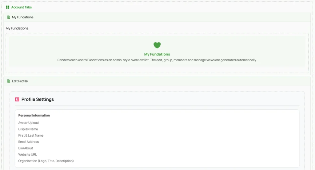
The first tab in the list becomes the default active tab. If you want the sign-in form to show to logged-out visitors, place a tab containing your login block first.
Block settings
The Account Tabs parent block has three settings, found in the Tabs Settings panel in the block inspector.
| Setting | Options | Default | Description |
|---|---|---|---|
| Orientation | Horizontal, Vertical | Horizontal | Places the tab bar above the panels or to their left. |
| Tab Style | Pills, Underline | Pills | Pills shows tabs on a rounded background bar. Underline draws a line under the active tab. |
| Accent Color | Hex color | #228b22 | The active tab color and highlight color. Set it to match your theme. |
The Account Tab child block has one setting you can change in the editor.
| Setting | Description |
|---|---|
| Label | The visible text on the tab button. Editing this also updates the slug automatically. |
The icon attribute accepts a Dashicons class name but icons are hidden on the frontend by default via CSS. This attribute is available if you apply custom styles that make them visible.
Deep-linking to a tab
Any tab can be opened directly by adding ?gf_tab=slug to the page URL, where slug is the tab’s URL slug.
The slug is derived automatically from the tab label. “Edit Profile” becomes profile if you set it manually during setup, or edit-profile-1 if the slug was auto-generated. You can read the effective slug from the rendered page source: look for data-slug="..." on a .gf-tab-button element.
Example: if your account page is at https://example.com/account/ and you have a tab with slug my-fundations, the direct link is:
https://example.com/account/?gf_tab=my-fundationsWhen the page loads with a matching gf_tab parameter, the block activates that tab and smoothly scrolls the tabs container into view.
If the slug in the URL does not match any tab, the block falls back to the first tab silently.
Logged-out behaviour
When is_user_logged_in() returns false, the server renders only the first tab’s inner content, with no wrapping tab structure at all. There is no tab bar and no panel markup, just the raw content of the first child tab.
Placing a login or registration block in the first tab is enough to handle both states: logged-out visitors see the form, logged-in visitors see the full tabbed interface.
You cannot configure which tab shows to logged-out visitors. It is always the first one.
What you can and cannot do
You can:
- Use any block inside a tab panel, including other Fundations blocks.
- Set a custom accent color per instance of the block.
- Use multiple Account Tabs blocks on the same page. Each gets a unique ID and operates independently.
- Deep-link to any tab from email notifications, other pages, or admin links.
- Override tab button and panel styles using the CSS classes listed in the Developer reference.
You cannot:
- Use the Account Tab block outside of an Account Tabs container. WordPress enforces this constraint.
- Add icons to tab buttons through the editor UI alone. The
iconattribute stores a Dashicons class but the frontend CSS hides Dashicons inside tab buttons by default. Showing them requires custom CSS. - Expose individual tab panels at their own URLs. The
?gf_tab=parameter activates a tab on the container page; it does not create separate addressable pages. - Remember the last active tab across page loads. The URL reflects the current tab but there is no session or cookie storage.
Troubleshooting
Tabs are not showing after the page loads. The frontend JS file public/js/get-fund-account-tabs.js must load on the page. This happens automatically when the block is present, but caching plugins that exclude JavaScript or aggressive script deferral can prevent it. Check the browser console for errors and confirm the script is present in the page source.
Deep-link URL opens the page but the wrong tab is active. Confirm the gf_tab value in the URL matches the slug exactly, including case. Slugs are lowercase. If the slug was auto-generated, check the rendered HTML for the data-slug attribute rather than guessing from the label.
Logged-out visitors see all tabs. This indicates the server-side render is not running and a cached version of the logged-in output is being served. Full page caching must exclude the account page, or use a cache variant based on login status. Check your caching plugin settings.
Vertical tabs do not appear side by side. On screens wider than 767px this layout requires the page to not constrain the block’s width below what the tab list and panel need. Check for max-width or overflow: hidden on a parent container.
Accent color has no effect. The color is set as a CSS custom property (--gf-tabs-accent) inline on the container element. If a theme or plugin applies a higher-specificity CSS rule using a fixed color, it will override the custom property. Inspect the .gf-tab-button.is-active element in your browser’s developer tools to confirm whether the variable is being applied.
Developer reference
CSS classes
| Class | Element | Description |
|---|---|---|
.gf-account-tabs | Container | Root element. Always present. |
.gf-orientation-horizontal | Container | Applied when orientation is horizontal. |
.gf-orientation-vertical | Container | Applied when orientation is vertical. |
.gf-style-pills | Container | Applied when tab style is pills. |
.gf-style-underline | Container | Applied when tab style is underline. |
.gf-tabs-list | Tab bar wrapper | Holds all tab buttons. Has role="tablist". |
.gf-tab-button | Tab button | A single tab trigger. Has role="tab". |
.gf-tab-button.is-active | Tab button | The currently active tab. |
.gf-tabs-panels | Panel wrapper | Holds all tab panels. |
.gf-tab-panel | Panel | A single tab content area. Has role="tabpanel". |
.gf-tab-panel.is-active | Panel | The currently visible panel. |
The accent color is available as the CSS custom property --gf-tabs-accent on the container element. You can reference it in custom styles:
.gf-account-tabs .gf-tab-button:hover {
    color: var(--gf-tabs-accent);
}
Block names
| Block | Name |
|---|---|
| Parent container | get-fund/account-tabs |
| Child panel | get-fund/account-tab |
Attributes reference
get-fund/account-tabs
| Attribute | Type | Default | Description |
|---|---|---|---|
orientation | string | horizontal | Tab bar direction. Accepted values: horizontal, vertical. |
tabStyle | string | pills | Visual style. Accepted values: pills, underline. |
accentColor | string | #228b22 | Hex color for the active tab indicator and hover state. |
get-fund/account-tab
| Attribute | Type | Default | Description |
|---|---|---|---|
label | string | "" | Visible text on the tab button. Shown as-is; no HTML. |
slug | string | "" | URL-safe identifier used in ?gf_tab=. Auto-derived from the label when the label changes. Sanitized with sanitize_title() server-side. |
icon | string | "" | Dashicons class name (e.g. admin-users). Stored but hidden by default on the frontend. |
Implementation files
includes/class-get-fund-account-tabs-block.php— block registration and server-side render callbacks.admin/js/get-fund-account-tabs.js— block editor UI (React/wp.element).public/js/get-fund-account-tabs.js— frontend tab switching, keyboard navigation, and deep-linking.public/scss/blocks/_account-tabs.scss— all block styles including orientation and style variants.
Hooks and filters
No actions or filters are exposed by this block. Behavior is controlled entirely through block attributes and CSS.